Philips-Medisize [Interactive Brand Center]
Philips-Medisize is a med tech development company, headquartered in Wisconsin. We were tasked with creating an interactive brand center where their clients could learn more about the company and their values. This project consisted of a wide range of disciplines, including 3D graphics, UI design, motion graphics, app development, interior design, and fabrication.
I was responsible for the 3D graphics that would be used across the board in different formats. Using abstract visuals that tells their brand’s story, our concept aimed to convey Philip’s Medisize’s attributes of trust, collaboration and thought.
Credits
UI Designer: Jack Steadson
3D Designer/Animator: Sam Wu
3D Question Answering Gods: Jack Steadson, Mitch Stomner
Developers: Andrew Bihner, Jake Rodelius, Gil Park
Client: Philips Medisize
Company: Next/Now
Creative Director: David Najarian
Art Director: Mitch Stomner
Producer: Josh Roberts
Section 1: Welcome Wall
The first section clients would see is the welcome wall, a dynamic looping animation on a digital canvas. This was designed to set the tone for the brand center using innovative technology and captivating imagery. In the background a generative, ambient animation would play, and in the foreground the visiting client’s logo would be displayed. This reinforces Phillips-Medisize’s emphasis on client centric approach to partnerships.
At first, individual elements are cohesive but not unified. Overtime these ambient pieces would coalesce to form a unified, strong, and simple shape. We used slow moving macro shots for a cinematic feel. This gradual transformation represents the new ideas being brought into the brand center. Just as the geometric shapes form from the abstract systems, the brand center tells the story of collaboration turning ideas into physical platforms.
Our first color would play during the initial morning visit, shifting to a color alt that would play in the afternoon and throughout the day.
Clover Concept
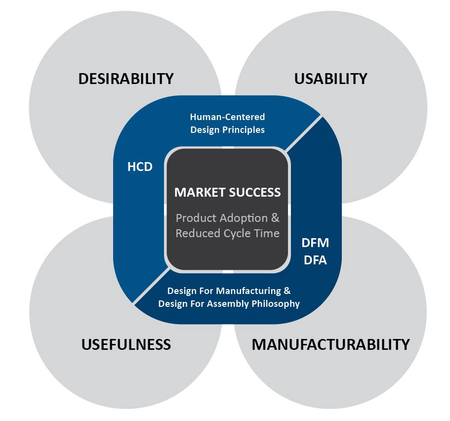
We chose the resolving shape to reflect Philip’s Medisize’s philosophical clover, which follows their mantra that a successful design must be simultaneously useful, usable, desirable, and manufacturable.
Design Board
Lighter morning color palette.


Color Alt Design Board
Darker afternoon color palette.


Site Photos
Section 2: Presentation Wall
The second section is the presentation wall, where this ambient idle would play in between clients presentations.
Color Alt
Site Photos

Section 3: 3x1 Display
The third section is the 3x1 display, which is a timeline exploration of product development over the course of a partnership. It is controlled by an interactive touch table showcasing the capabilities and manufacturing facilities. The purpose is to demonstrate how the range of capabilities can meet client’s needs at any point in their journey. This ambient idle would play behind the UI graphics.
3D Design and animation by Sam Wu, UI Design by Jack Steadson.
Styleframe

UI Design + Abstract Ambient Example
Site Photo

Section 4: Corner Totem
The fourth section is the corner totem, which is an interactive touch screen that aids in the discussion of how Phillips-Medisize does business, touching on partnerships/resources with Molex + Koch. This ambient idle would play behind the UI graphics.
Styleframe